
Exterior Wall Paint Guide: Colour Combinations, Charts, Designs & Textures That Actually Work
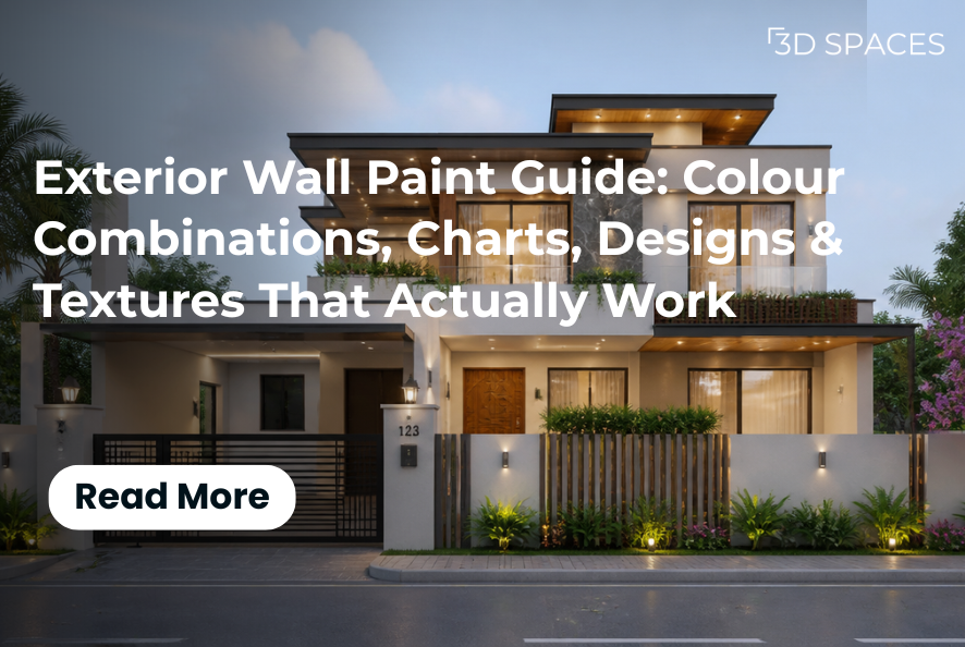
Exterior paint has to survive heat, monsoon dampness, dust, UV fading, and much more; therefore, it needs careful consideration.
There's a particular kind of dread that comes with standing in front of a paint shade card, squinting at forty shades of "off-white", and trying to picture how any of them will actually look on your house. Here's the thing nobody tells you upfront: Exterior wall paint is not the same decision as interior paint, and treating it that way is how most people end up repainting within three years, frustrated, over a colour that looked perfect on a tiny swatch and completely different across an entire façade in full sun.
Exterior paint has to survive heat, monsoon dampness, dust, UV fading, and years of being stared at by your neighbours, so getting the colour, the combination, and the texture right isn't just about taste; it's about durability, light, and the personality of the building itself. This guide walks through all of it: how to actually choose a colour combination, how to read a shade chart without getting overwhelmed, which exterior designs are working right now, and what texture paint can do that flat colour simply can't. Think of it as the first conversation with a designer that you would have before you ever picked up a brush.
Why Exterior Wall Paint Deserves More Thought Than You're Giving It
Exterior wall paint does two jobs at once: it protects and it communicates. Structurally, a good exterior paint acts as a shield against sun, rain, humidity, and pollution, which is why exterior-grade paints are formulated differently from interior ones, with better weather resistance, UV stability, and often anti-fungal or waterproofing additives. Aesthetically, it's the very first thing anyone notices about your home, before the architecture, before the landscaping, before anything else.
Designer's take: We always tell clients the same thing: pick your exterior colour last, not first. Look at your roof tiles, your window frames, your gate, your boundary wall, and any stone or wood elements you're not planning to change. Your paint colour needs to sit with those elements, not fight them.
How to Choose the Right Exterior Wall Paint Colour Combination
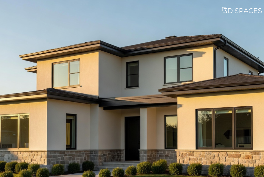
A warm cream body with charcoal trim is one of the most versatile exterior combinations, no matter what the architectural style.
A colour combination that looks stunning in a photo can look completely wrong on your actual street, in your actual light. A few things genuinely matter more than personal preference here:
Climate and light direction. Homes that get intense afternoon sun often look washed out in very pale colours and better in colours with a bit of depth. North-facing walls in cooler light can handle warmer tones better.
Building material. Brick, stone cladding, and textured concrete all interact with paint differently than smooth plaster does.
Neighbourhood context. A colour combination that looks bold and modern in isolation can look jarring next to a row of traditional homes and vice versa.
Undertones. This is the one people miss most. Whites aren't just white; they lean warm, cool, or "greige" (grey-beige), and pairing a warm-toned base with a cool-toned trim is one of the most common reasons a finished exterior looks slightly "off".
Also Read: 11 Best Outside Colour Combinations for Your House to Enhance Curb Appeal in India (2026)
As of 2026, the biggest shift in exterior colour combinations has been away from stark whites and cool greys and toward warmer, nature-inspired palettes; think creamy off-whites, soft greiges, muted sage and olive greens, and earthy terracotta or clay tones, often finished with a matte or flat body colour paired with a satin trim for subtle contrast. The general principle behind most good exterior wall paint colour combinations is simple: one calm, dominant body colour, one supporting shade for trim, borders, or a second block of the façade, and optionally one deeper accent colour used sparingly on a door, gate, or single feature wall.
Popular Exterior Colour Combinations
A warm white or cream body with charcoal or deep brown trim is a classic and forgiving of most architectural styles
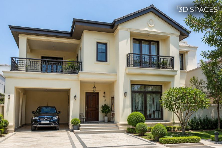
A velvety cream body accented by sharp charcoal trim offers a sophisticated, high-contrast look that works effortlessly across varied Indian architectural styles, especially when paired with natural wood elements.
Soft sage or olive green with warm white trim: calm, grounded, works beautifully near greenery
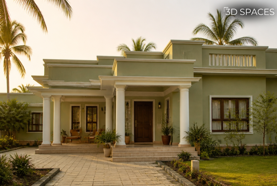
Deeply grounded and calming, soft sage green with warm white trim is the perfect color combination for homes surrounded by greenery, allowing the structure to blend beautifully with its natural environment.
Also Read: How to Choose the Right Paint Colour for Your Wall
Greige (grey-beige) body with a deep navy or black accent door: quietly modern
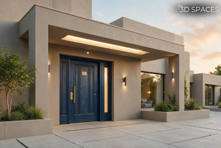
For a quietly modern aesthetic, we paired a calming greige body with a deep navy blue accent door. This low-key contrast adds depth and personality without shouting.
Terracotta or clay-toned accents against a neutral off-white base: warm and earthy, especially suited to sunny climates
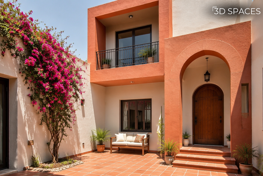
Sunny climates call for warmth. Here, clay-toned terracotta accents provide a rich contrast against a textured off-white base, channeling an organic, artisan vibe.
Dusty blue with crisp white trim and stone accents a coastal, relaxed feel
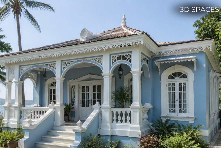
For that relaxed, permanent-vacation feel, dusty blue paired with crisp white trim and rugged stone cladding creates an inviting, breezy aesthetic ideal for both coastal and urban getaways.
Wall Colour Combination Outside: Getting the Proportions Right
Choosing colours is only half the job; how you divide those colours across the exterior matters just as much. A common designer rule of thumb is the 60-30-10 split: roughly 60% of the visible exterior in your dominant body colour, 30% in a secondary shade (often for a lower half, a boundary wall, or a distinct architectural block), and 10% as an accent, usually the door, window frames, or a small feature area.
Designer's take: The mistake we see most often is people choosing two colours they love individually and splitting the wall exactly in half, vertically, right down the middle. It rarely works. Let the architecture decide the split; a stepped façade, a balcony line, or a change in material is usually a natural place for the colour to change, not an arbitrary straight line.
Outdoor colour combinations also need to account for shared walls and boundary walls, which get more direct sun exposure and weathering than the main house façade. They are often worth a slightly more weather-resistant or slightly deeper shade so fading isn't as visible over time.
How to Actually Use an Exterior Wall Paint Colours Chart
Shade cards and colour charts are genuinely useful, but only if you use them properly, which most people don't.
Never trust the tiny printed swatch alone. Paint brands sell sample pots specifically because the colour on a 1-inch chart chip and the colour on an entire wall behave completely differently under real light.
Test in multiple light conditions. Paint a sample patch and look at it in the morning, at midday, and in the evening. The same colour can look three shades different depending on the time of day.
Look at the chart in groups, not in isolation. Most colour charts are organised in "families" (warm neutrals, cool greys, earth tones, greens, and blues). Comparing a shade to its neighbours on the chart tells you more about its undertone than comparing it in isolation.
Match trim and body colours from the same chart family when possible; cross-brand matching can introduce subtle undertone mismatches that are hard to spot until the paint is already up.
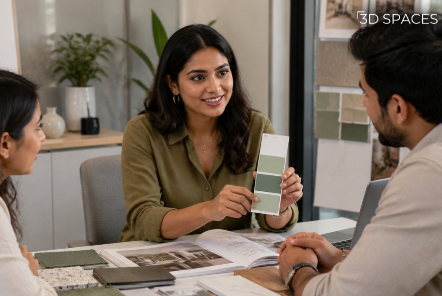
Shade cards and colour charts are genuinely useful, but only if you use them properly, which most people don't.
Exterior Wall Paint Designs Worth Knowing About
Flat, single-colour exteriors will always be a safe choice, but a lot of homes today are leaning into more considered design moves:
Two-tone or block-colour façades, where a distinct architectural section; an upper floor, a balcony surround, a boxed-out window – gets a separate, complementary colour.
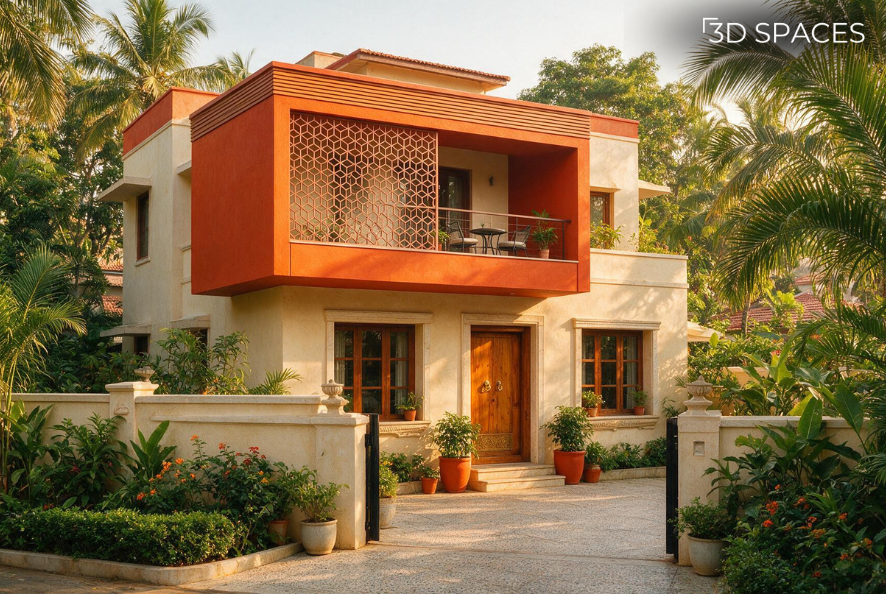
Highlighting structural elements like balconies or upper floors with a rich, complementary shade (like terracotta or burnt ochre) adds depth and modern flair to contemporary Indian elevation designs.
Textured accent panels, often on a single feature wall, paired with flat colour everywhere else
Also Read: Unique Room-by-Room Wall Design Ideas
Geometric or linear detailing, using masking to create clean lines, borders, or panel effects rather than painting the whole wall one flat tone
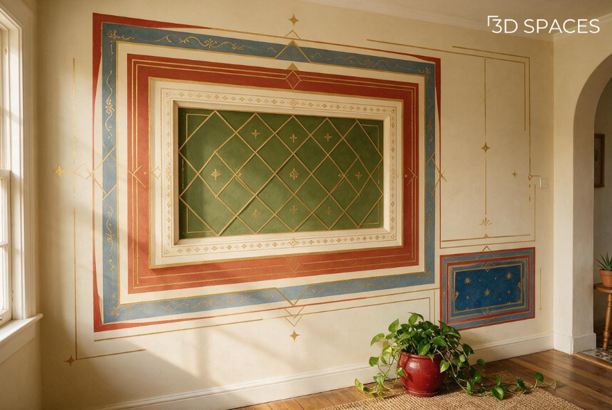
Clean geometric lines and contrast borders turn plain boundary walls and facades into structured, graphic canvases, proving that strategic paint techniques can rival expensive wall cladding.
Stencil or pattern work, more common on boundary walls, porches, or smaller accent areas than full façades
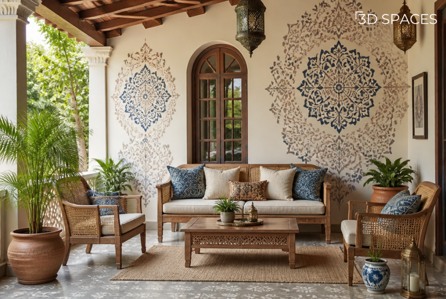
Bringing intricate pattern work to shaded areas like verandahs, boundary walls, or porticos offers a nod to traditional craft without overwhelming the main exterior facade.
Colour-drenching, where trim, window frames, and body colour are all kept in the same tonal family for a calm, monochromatic look – a trend that's moved from interiors out to exteriors recently
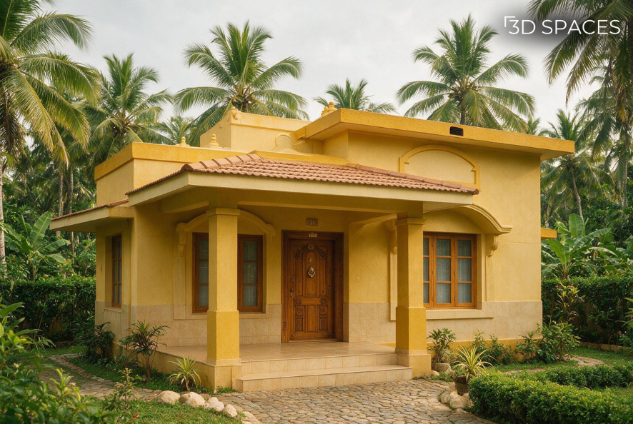
Drenched in tranquility. Taking a single, serene shade of olive green across the walls, trim, and window frames creates a seamless, monochromatic retreat. A moody interior trend that looks just as stunning outdoors!
Exterior Wall Textures: When Flat Colour Paint Just Isn't Enough
Texture paint isn't just decorative; it genuinely changes how a wall performs and how forgiving it is over time. A few common types:
Sand-finish or grainy-texture paints: Subtle, low-maintenance, and good at hiding minor surface imperfections and hairline cracks
Stone or pebble-textured coatings: Heavier texture, often used on a single feature wall or the base of a building adds real depth and a tactile, grounded feel
Roller-texture finishes: Created with a specialty textured roller rather than an additive, giving a subtle pattern without the cost of a full textured coating
Smooth premium emulsions: Not a texture at all, but worth mentioning because a very smooth, high-sheen finish on an exterior can actually highlight surface flaws that a texture would hide
Designer's take: Texture paint is one of the most underused tools in exterior design. It adds depth without adding another colour; it tends to hide dust and minor wall imperfections better than flat paint, and it photographs beautifully in raking light, but it does need proper surface preparation, or the texture ends up looking patchy rather than intentional.
Final Thoughts
At the end of the day, exterior wall paint is one of those decisions that quietly shapes how a home feels long before anyone walks through the front door. The right colour combination, chosen with an actual understanding of light, architecture, and material rather than a swatch you liked on a screen, is what separates a house that looks considered from one that looks like it happened by accident. Whether you're leaning toward a classic warm-white-and-charcoal pairing, an earthy sage-and-cream palette, or a textured feature wall that adds depth without adding another colour, the goal is the same: pick something that feels like your home in your light, not someone else's Pinterest board. Take the time to sample properly, trust the proportions more than the individual colours, and don't be afraid to bring in a designer's eye if you're stuck. A second opinion before the paint goes up is a lot cheaper than a repaint two years later.
Frequently Asked Questions
-
There's no single "best" combination, and it depends on your climate, architecture, and surroundings. A warm neutral or off-white body paired with a deeper trim colour (charcoal, brown, or navy) is one of the most consistently reliable choices across different home styles.
-
Most designers recommend sticking to two or three colours total: one dominant body colour, one supporting or trim colour, and, optionally, one accent used sparingly.
-
Matte or flat finishes are commonly used for the main body colour because they hide surface imperfections well, while a satin or slightly glossier finish is often used on trim, doors, and window frames for subtle contrast and easier cleaning.
-
Yes, texture paint can add visual depth, help hide minor cracks or surface unevenness, and often holds up well over time, though it needs proper surface preparation to look intentional rather than patchy.
-
Deeper, saturated colours (especially reds and dark blues) tend to fade faster under direct UV exposure than muted neutrals, earthy tones, and greens; if fading is a concern, ask specifically about UV-resistant or fade-resistant exterior formulations.
-
Most exterior paint jobs last anywhere from 5 to 8 years depending on climate exposure, paint quality, and surface preparation, though boundary walls and south-facing façades exposed to harsher weather may need attention sooner.
