
Inside a Warm, Personal 3 BHK Home Transformation in Gurugram

How 3D Spaces turned a new apartment in Sector 61 into a practical, elegant family home designed around everyday life.
For this young family in Smart World Orchard, Sector 61, Gurugram, the brief was clear without being overly complicated. They wanted their new apartment to feel warm, comfortable and personal. A little luxurious, yes, but not flashy. They needed plenty of storage, a practical kitchen, a dedicated puja space and interiors that could keep up with everyday family life.
Most importantly, they did not want their home to feel like another show apartment.
They wanted it to feel like theirs.
That is the starting point 3D Spaces returns to on every project, and it's what shaped this transformation. Instead of forcing the home into one particular interior style, the team created a visual language that could move naturally from room to room, while still giving every space its own personality.
Here is how that transformation came together.
The Brief: Warm, Practical and Personal
The family came to the design team with a wish list that many young homeowners will recognise.
They wanted a home that felt:
Warm and welcoming, with a touch of luxury
Practical enough for everyday family life
Equipped with plenty of storage
Easy to maintain
Comfortable for a young child
Personal rather than copied from a catalogue
Complete with a dedicated space for their prayer routine mirror screen
The challenge was turning all of these requirements into one cohesive home.
After all, storage, functionality and aesthetics can easily start competing with each other. The design needed to make room for everything the family needed without making the apartment feel crowded.
The solution was to create a few recurring design details that could connect the rooms without making them look identical.
The Design Language: Arches, Fluted Glass and Brass
Three details became the thread running through the home: arched forms, fluted glass and warm brass accents.
The arches added softness to the apartment and helped break up the straight lines of wardrobes, cabinetry and furniture.
Fluted and reeded glass brought in texture and a sense of privacy while still allowing light to move through the spaces.
Brass details added warmth and a subtle touch of luxury.
The important part was that these elements were not simply repeated everywhere. They were interpreted differently in each room.
The arch became a mirror-screen at the entrance and later appeared in the puja unit. Fluted glass appeared in the entrance and kitchen. Brass showed up through hardware, furniture and framing.
The result is a home where each room feels different, but nothing feels out of place.
The Entrance: Creating a Foyer Where There Wasn't One
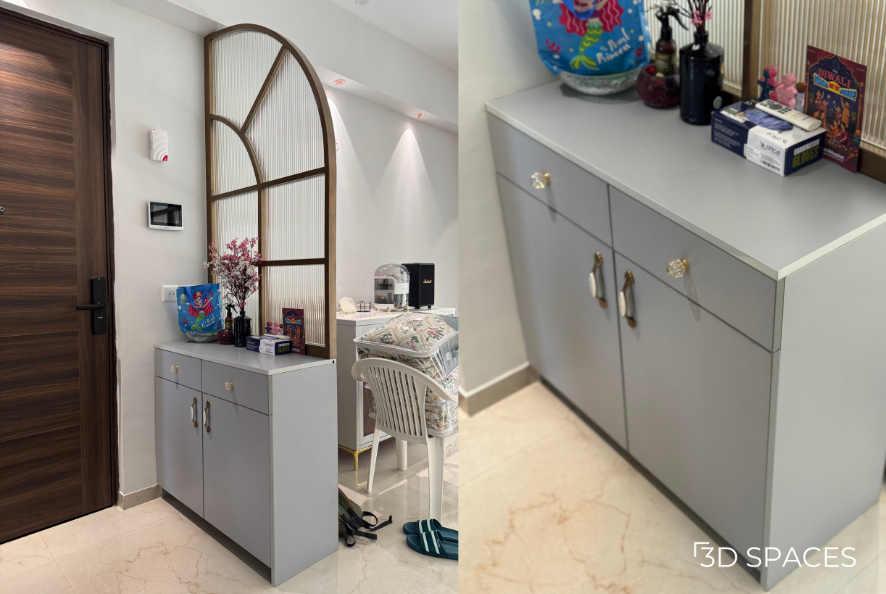
An oversized arched mirror-screen gives the entrance a sense of identity without taking away from the openness of the living area.
The apartment's front door opens almost directly into the living and dining area, so there wasn't a traditional foyer to create that transition between the entrance and the rest of the home.
The obvious solution would have been a full partition.
But that would have taken away valuable space and made the entrance feel heavier.
Instead, the team created an oversized arched mirror-screen with fluted glass and bronze-toned metal framing.
It gives the entrance its own identity without completely closing it off.
A simple console underneath adds a practical surface for keys, bags and all the little things that tend to collect near the front door.
The mirror also helps make the entrance feel larger, while the arched shape immediately establishes one of the home's key design details.
It is a good example of how a design feature can solve a practical problem at the same time.
The Living Room: Comfortable With a Little Privacy
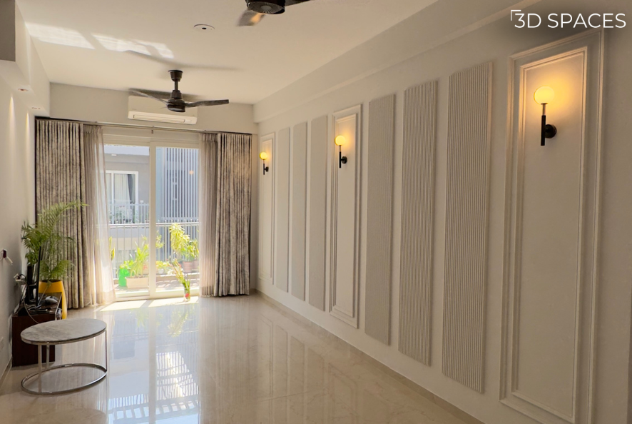
Smoked glass and brass accents bring warmth to the living room, while patterned window film adds privacy without blocking natural light.
Because the apartment is on a lower floor, privacy from the outside was an important consideration for the family.
Instead of covering the windows with heavy curtains or blinds, the design team used a decorative frosted glass film with a floral pattern.
It gives the family more privacy while allowing natural light into the room.
More importantly, it does not look like a purely functional fix. The floral pattern becomes part of the room's visual story.
The furniture keeps the atmosphere soft and welcoming. A teal and cream bouclé sofa brings in colour and texture, while a brass and smoked-glass side table picks up on the warmer metallic details used elsewhere.
The room feels polished, but still comfortable enough for everyday family life.
And that balance was important.
The aim was never to create a living room that looked perfect but felt untouchable.
The Kitchen: Good-Looking, But Ready for Real Life
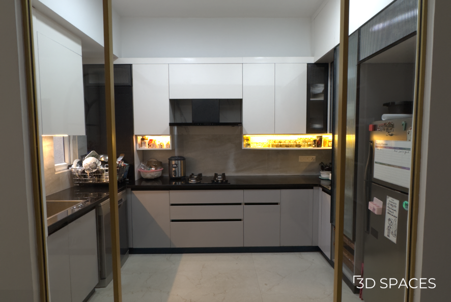
Fluted glass and brass frame the kitchen entrance, while white cabinetry, black stone and under-cabinet lighting keep the space practical for everyday cooking.
The kitchen is one of the spaces where the difference between a beautiful design and a genuinely useful one becomes obvious.
Here, the kitchen entrance was given the same attention as the front door.
A brass and fluted-glass double door creates a defined entrance while allowing the kitchen to remain visually connected to the living spaces.
Inside, the palette becomes much more practical.
Glossy white overhead cabinets keep the space bright, while black stone counters and backsplash create contrast and are easier to maintain through everyday cooking.
Under-cabinet lighting adds another layer of functionality, making food preparation easier and reducing the shadows that often fall across the worktop.
It is the kind of detail that might not be the first thing you notice in a photograph, but you definitely notice it when you are actually cooking.
Because a family kitchen has to handle much more than a beautiful Instagram moment.
It has to handle weekday breakfasts, rushed dinners, grocery bags, spills, cleaning and everything in between.
The Master Bedroom: Soft, Calm and Comfortable
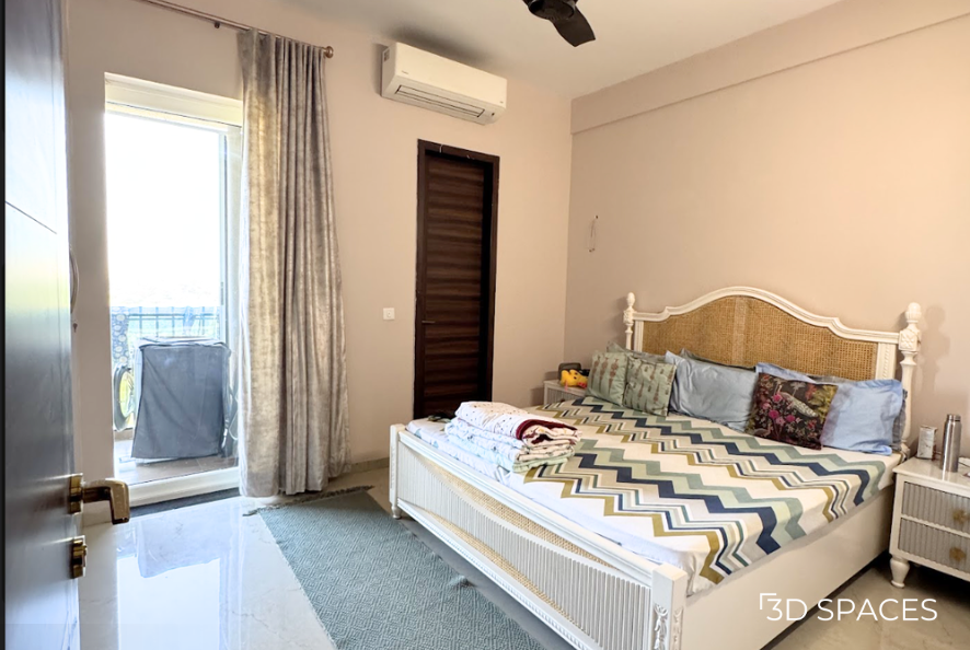
A cane-panel bed, mauve-toned walls and soft textures give the master bedroom a calm, comfortable feel.
The master bedroom takes a softer approach to the home's design language.
A white cane-panel headboard creates a textured focal point against calm mauve-toned walls.
The bedspread introduces a subtle chevron pattern, while the rest of the room stays relatively quiet.
Floor-length curtains, a woven runner rug and a ceiling fan paired with air conditioning make the room comfortable for everyday use.
There is a sense of calm here that comes from keeping the palette restrained and allowing texture to do most of the work.
It feels like a bedroom first and a designed space second, which is exactly what you want from a room meant for winding down.
Storage That Blends Into the Design
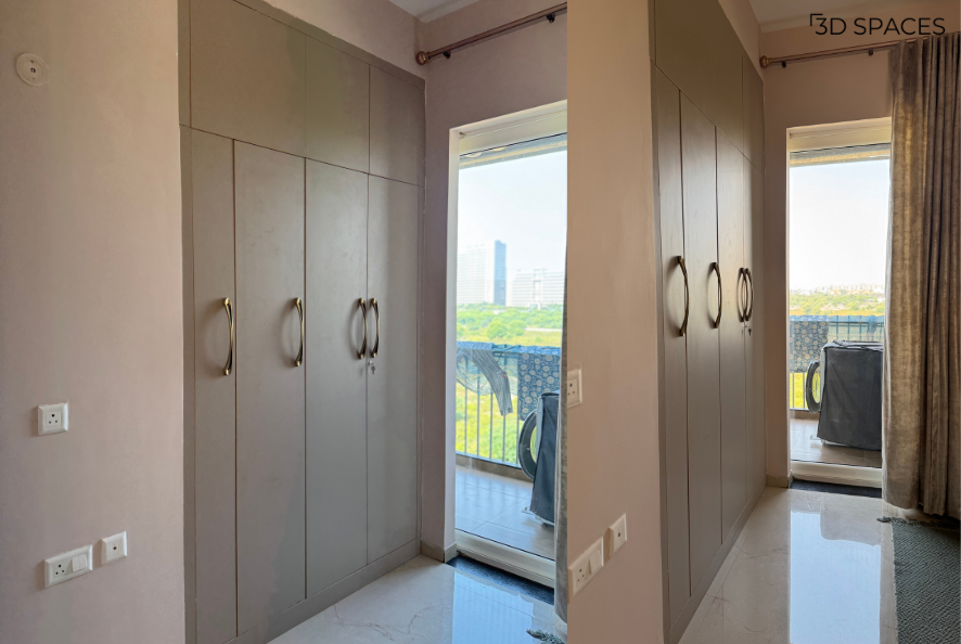
Floor-to-ceiling wardrobes and integrated loft storage make the most of the bedroom walls while keeping the floor space clear.
Storage was one of the family's biggest requirements, and the wardrobes were planned with that in mind from the beginning.
Near the balcony, a floor-to-ceiling wardrobe with a loft makes use of the full height of the wall.
Instead of adding a separate dresser that would take up more floor space, the wardrobe incorporates additional storage vertically.
Sculptural brass handles add a decorative touch and connect the wardrobe to the home's wider material palette.
A second wardrobe in a soft mauve finish was designed with internal shelving for the child's clothes, shoes and toys.
From the outside, the wardrobe keeps the room looking clean and uncluttered.
Inside, it quietly does a lot of work.
For a family with a young child, that hidden organisation can make everyday life much easier.
Bathrooms That Feel Calm, Not Clinical
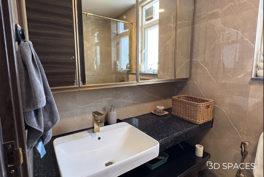
Taupe marble-look tiles, brass-framed shower partitions and floating vanities give the bathrooms a warm, contemporary finish.
The bathrooms continue the home's warm, understated aesthetic.
Both spaces use taupe and marble-look large-format tiles, creating a calm backdrop without making the rooms feel overly busy.
Brass-framed glass shower partitions bring in the same warm metallic finish seen elsewhere in the apartment.
The vanity areas combine floating black stone counters with vessel sinks, while multi-panel mirror cabinets provide concealed storage for toiletries and everyday essentials.
That keeps the countertops cleaner and easier to maintain.
The bathrooms feel connected to the rest of the home rather than treated as purely functional spaces.
A Puja Unit Designed Into the Layout
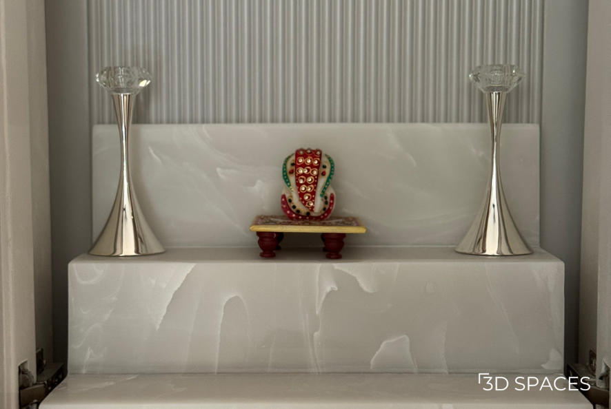
A custom puja cabinet fits neatly in home.
The puja space was one of the family's more personal requirements.
The apartment did not have a natural room or large alcove that could be dedicated to prayer, so the design team had to find a way to create one without taking away from the existing layout.
The solution was a tall standalone puja cabinet fitted between two bedroom doors.
The unit uses a fluted-glass arch that echoes the arched feature at the entrance.
That small connection makes a big difference. Instead of looking like a separate piece added after the rest of the interiors were finished, the puja unit feels like it belongs to the home's overall design.
Open shelving beside it provides space for personal curios and decorative pieces, making the corner feel intimate and lived-in.
It is a compact solution, but one that gives the family the dedicated space they wanted without needing an entire room.
Bringing Everything Together
What makes this home interesting is not one dramatic design feature.
It is how the smaller decisions work together.
The arched entrance introduces the design language. Fluted glass carries it into the kitchen. Brass details appear throughout the furniture and hardware. The same warmth continues into the bathrooms and bedrooms, while practical storage keeps the home from becoming visually cluttered.
At the same time, the rooms are not carbon copies of each other.
The living room has more colour and texture. The master bedroom is softer. The kitchen is brighter and more functional. The puja unit feels personal and intimate.
That balance is what keeps the home from feeling repetitive.
Designed for the Family, Not Just the Handover Day
A successful interior project is not just about how the home looks when everything is freshly styled.
It is about how well it continues to work once real life begins.
For this family, that meant creating storage for everyday belongings, a kitchen that could handle regular cooking, privacy without sacrificing light and a layout that could accommodate their routines.
The project also needed to stay on schedule.
For a young family preparing to move, delays can quickly become stressful. A delayed handover can mean extended temporary arrangements, disrupted work schedules and living around unfinished work.
The 3D Spaces team took the project through design finalisation, execution and styling according to the agreed timeline so the family could move into a finished home rather than a work in progress.
The Final Result: A Home That Feels Like Theirs
By the time the final pieces were in place, the original brief had taken shape in a very tangible way.
The home feels warm without being overly formal. It has luxurious details without becoming flashy. There is plenty of storage, but it does not dominate the rooms. The kitchen is practical without looking purely functional. And the family's puja space has been given a meaningful place within the overall design.
Most importantly, the apartment does not feel like a show home.
It feels lived in.
It feels considered.
And it feels like it belongs to the family who lives there.
That is perhaps the biggest difference between decorating a house and designing a home.
A beautiful interior should photograph well, of course. But the real test comes later, when there are toys on the floor, groceries on the kitchen counter, guests arriving at the door and a family settling into their everyday routine.
If the space still works, then it has done its job.
Planning Your Own Home Transformation?
Your home does not need to look like anyone else's. Whether you are moving into a new apartment in Gurugram or redesigning an existing home, the right interior design should start with how you live, what you need and what you want your space to feel like.
Ready to turn your ideas into a home that feels like yours? Get a free consultation with 3D Spaces and start planning your interiors.
FAQs
-
It starts with a consultation where we understand how you live, day to day, not just what you want the rooms to look like. From there we move into space planning, materials, and the overall design direction.
-
We usually pick two or three recurring materials or shapes, in this home it was arches, fluted glass, and brass, and let each room interpret them differently. Same language, different sentences in every room.
-
Definitely. Floor-to-ceiling wardrobes, lofts, and built-in cabinetry let you store a lot vertically while keeping your actual floor space open. The key is planning storage early, not adding it in after the layout is already fixed.
-
Start with how you actually live, your routines, what you collect, what you never use. The most personal homes come from decisions built into the design early, not decor added at the end.
-
Timelines depend on the size of the home and how much customisation is involved, but a clearly planned design with a managed execution process is what keeps a project on schedule. We build the timeline with you upfront so there are no surprises.
-
Yes, 3D visualisation lets you walk through the proposed layout, materials, and finishes before execution begins, so changes can happen on screen, not on site.
-
Start by looking at completed projects rather than just mood boards, since that shows you how a design team handles real layouts and real client requirements. 3D Spaces is based in Gurugram and works across Delhi NCR, with a process built around consultation, 3D visualisation, and execution under one team.
